Case Study
DOWL Engineering
Website Design and Development
Challenge
Discovery
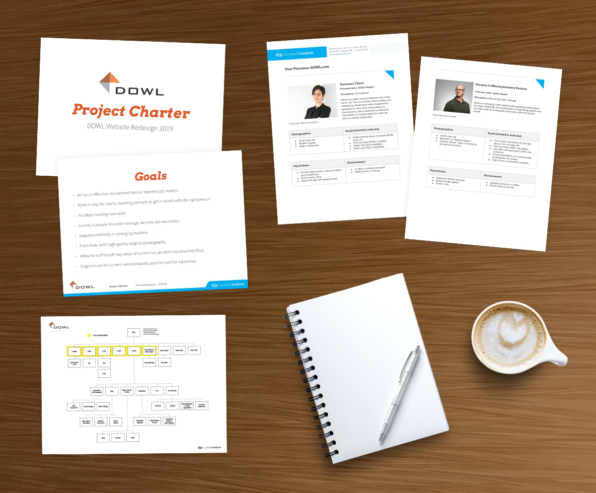
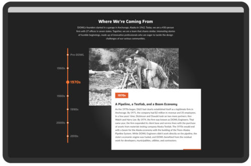
We met with DOWL to understand their vision for the new website. The insights we gathered included peer and competitor websites, user priorities, desired features, and others. An essential aspect of this research is defining the “sweet spot,” where the client’s and their audiences’ priorities overlap. The latter is helped by developing user personas, which allow us to envision better how real people might use the site. We compiled what we learned into a project charter and shared it with key stakeholders, making it easier to keep everyone on the same page.
Process
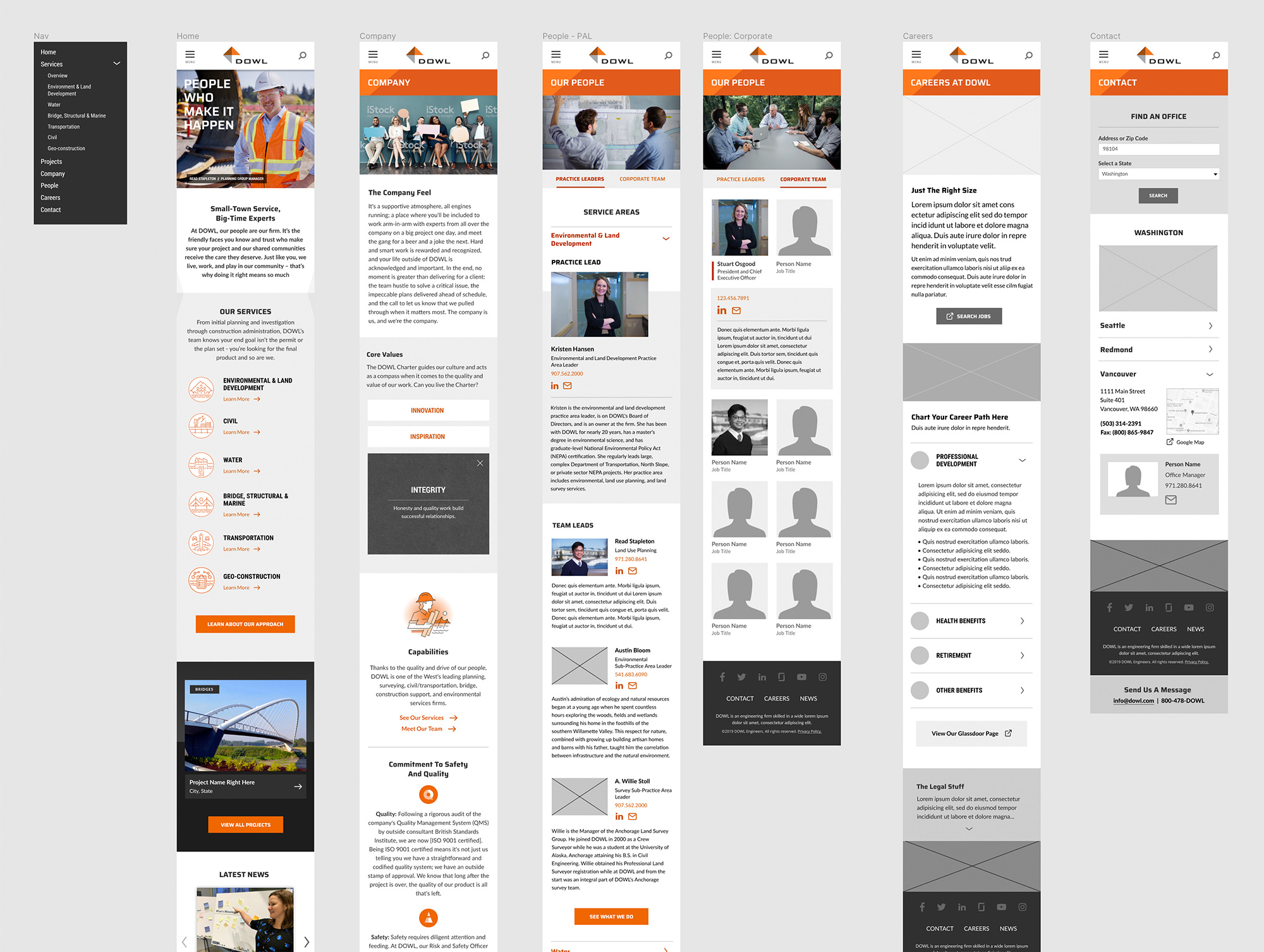
Web site design and development is complex stuff—a good process goes a long way in making a project go smoothly. For DOWL and others, our model is built around the idea of incremental progress, with client reviews at critical junctions. This is facilitated by the use of prototypes, mood boards, wireframes, and design layouts. The purpose is twofold: first, it allows for the evaluation of critical elements without the distraction of others (e.g., page content vs. design layout). Secondly, each stage of review and approval builds on another, which reduces the likelihood of late-stage surprises. This approach kept DOWL closely involved all along the way.
Directing Video and Photos
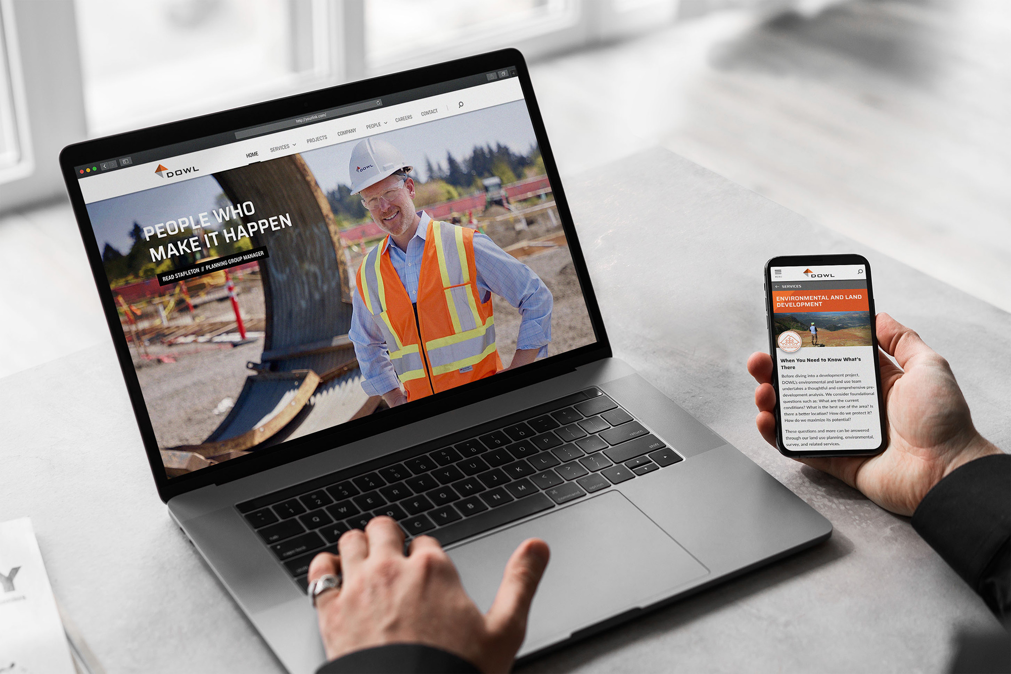
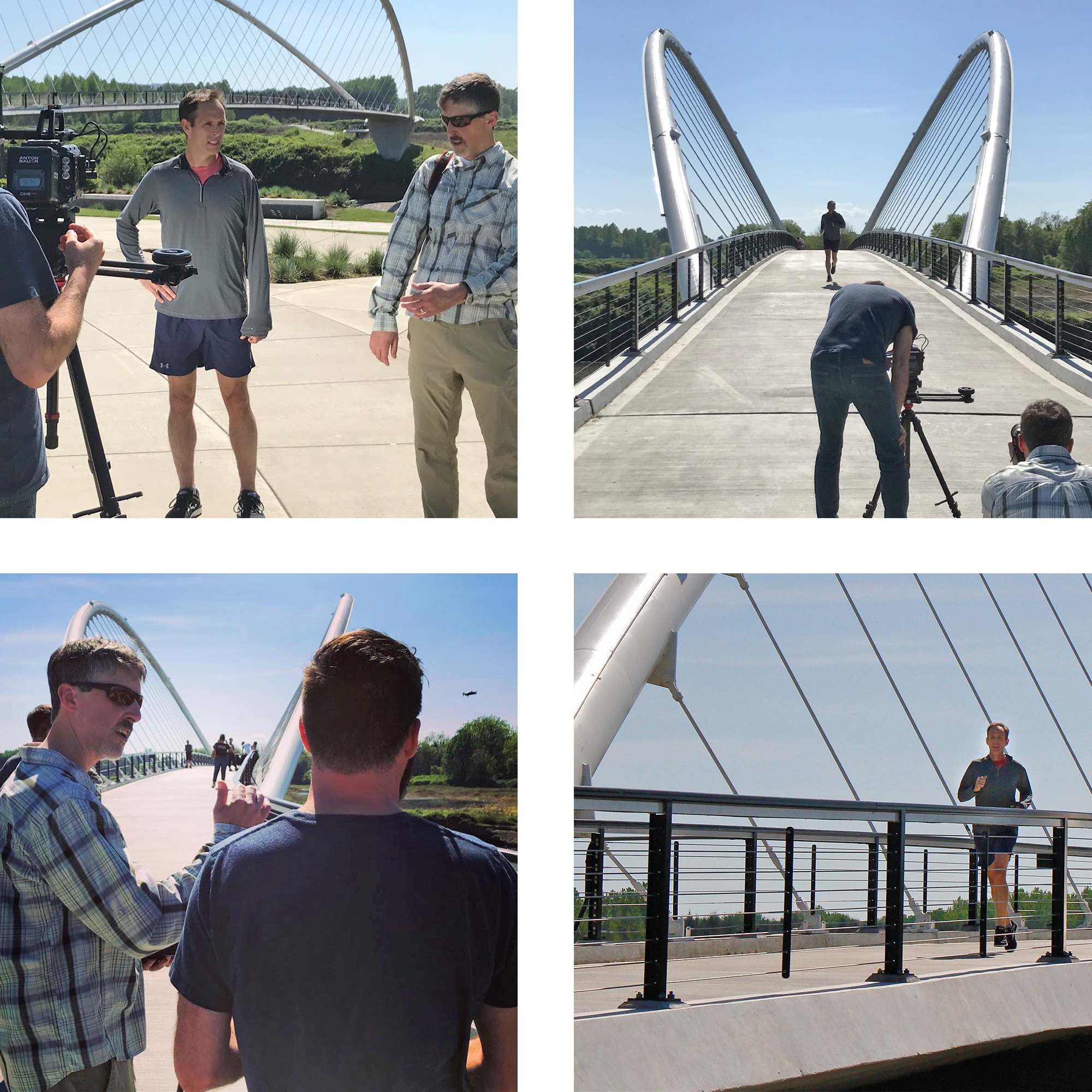
The client wanted to feature a “hero” video on the Home page, along with new still photos throughout the site. Though they preferred to use existing vendors for production, DOWL looked to us to provide direction. Our experience with videography, photography, and web development allowed us to help them govern quality, look for creative concepts—and make sure the final product would be compatible with the website.
Finding Opportunities
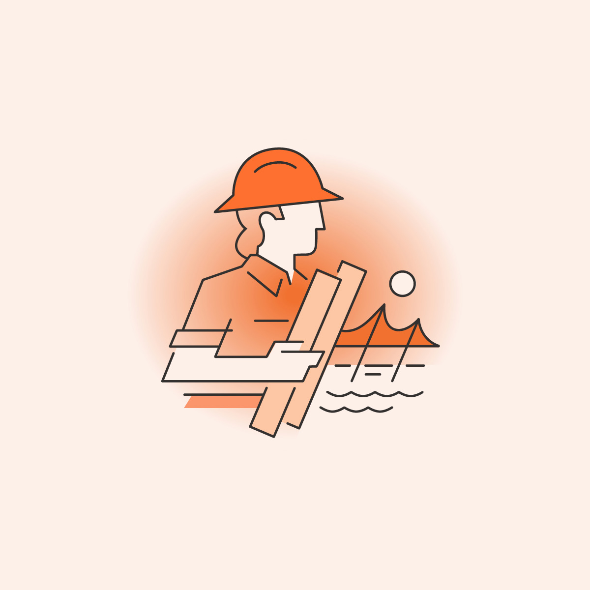
Brand standards are essential for governing consistency and quality. But designers must use care to keep new material from feeling stale and robotic. We were able to find opportunities to create something new and fresh while feeling 100% DOWL.
Advanced Functionality
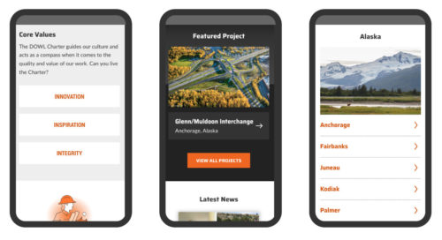
Often clients ask for features but don’t grasp the complexity behind them. That’s ok; we don’t expect them to. That’s why they come to us: for solutions.
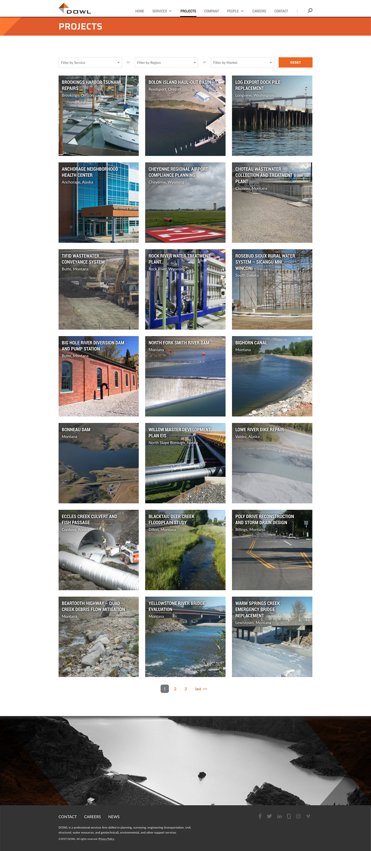
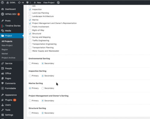
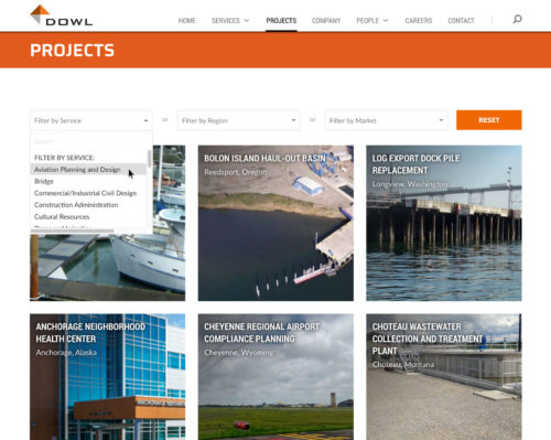
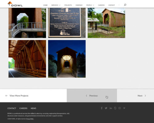
DOWL requested, and we delivered a “weighted” project filtering system giving them fine-grained tools to assign the case studies that best illustrate a given service. Also, the system remembers the result set so the user can browse it via “Next” and “Previous” buttons, then return to the filtered results page right where they left off.
Results
The final site delivered a marked improvement in usability and elevated the DOWL brand as an important reflection of their culture and vision. Here’s what we accomplished:
- Found new creative opportunities within the brand territory
- Showcased DOWL’s skilled team while making their contact info highly accessible
- Made it easy to find relevant projects, then get connected to people who can help
- Improved the site’s ability to attract talented career-seekers
- Made a happy client. We helped their Marketing Director achieve successful outcomes.
“Holy cow. I just lost about 30-minutes exploring your new website. I was drawn-in from the home page and the focus on your people using video. Wow. Very forward thinking. I also enjoyed reading about your employees and learned that you were raised on a dairy farm.
From top to bottom this website “feels” like DOWL. More specifically, this feels like the DOWL you have built.
I will feature this in the August 28th GBA NEWSLog and I am positive you will get lots of positive feedback. It sets an example for all our members of what a website should look and feel like to highlight their culture, values, and capabilities to inform clients and recruit and retain top talent.
Congratulations Stewart. This is the best I have seen.”
Let’s talk about your project.
We’ll do a lot of listening, and always look to offer good advice. This could be the start of something great.
Get Started