Case Study
Explore Tualatin Valley
Website Redesign
Challenge
In a Nutshell
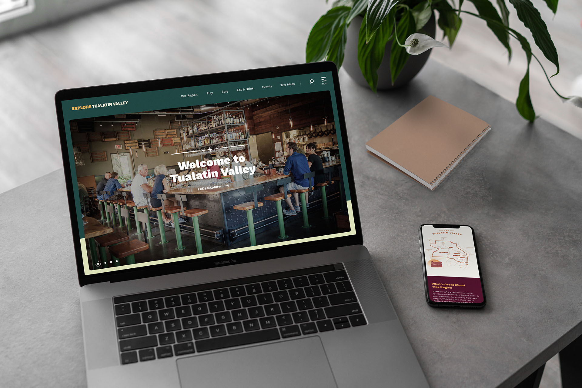
We took a site that was bland and dated in terms of the visual branding, with disorganized content that was hard to find, and created a site that is tasty, fun, visually appealing, more effective and more organized for a wider audience. All while serving the client’s goals by providing design leadership.
Leveraging the Word “Explore”
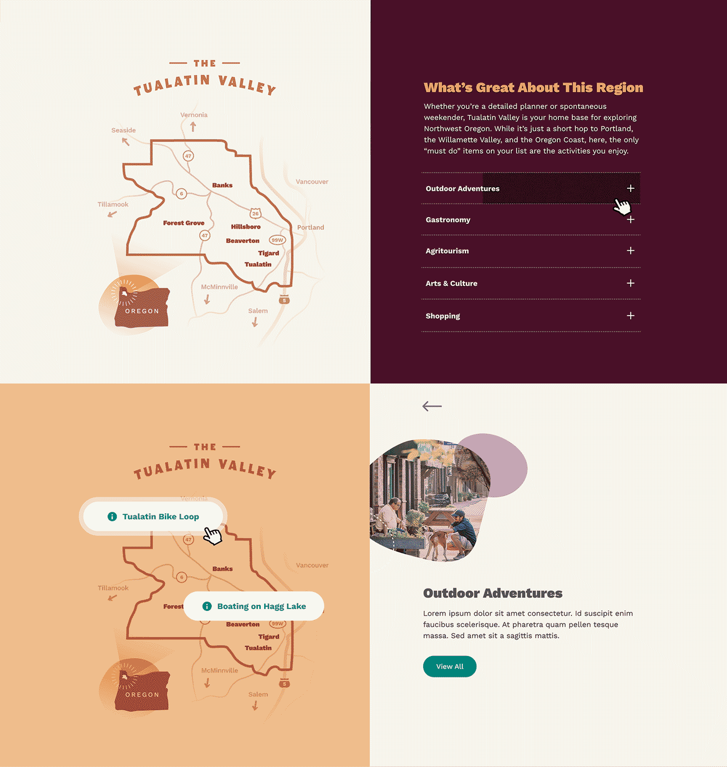
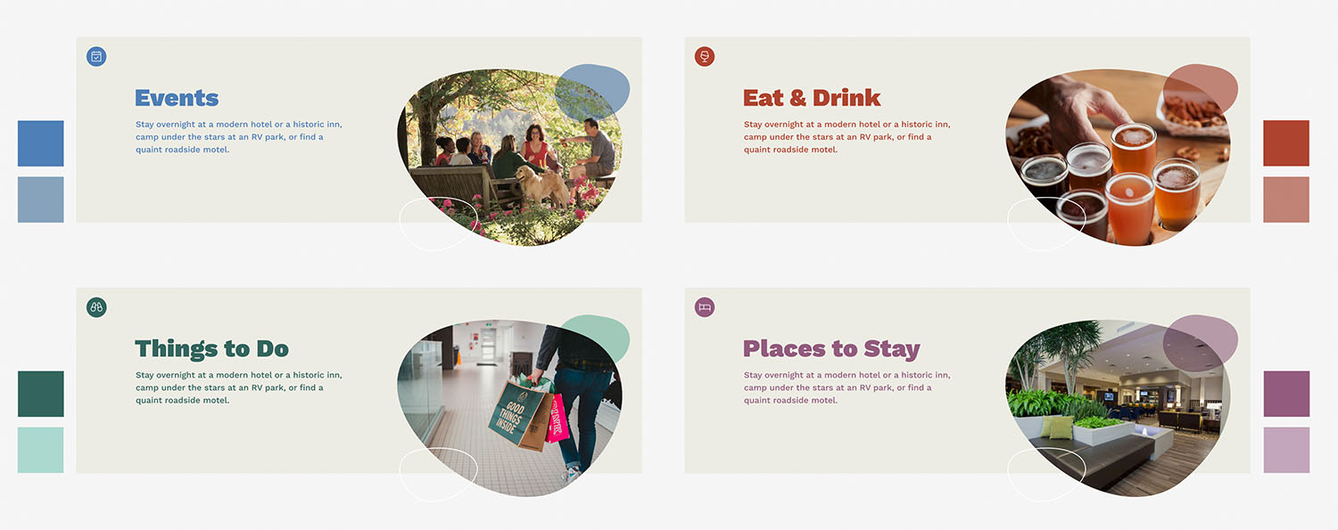
As we set out to create a site that is both useful and delightful, we wanted to extend the region’s invitation to “Explore.” So we created a visual reference for the region itself, through a simple map graphic showing Tualatin Valley’s proximity to well-known Oregon destinations. We also made sure the main navigation pathways — Eat & Drink, Things to Do, Places to Stay, and Events — were easy to find and explore further, using integrated maps and event calendars.
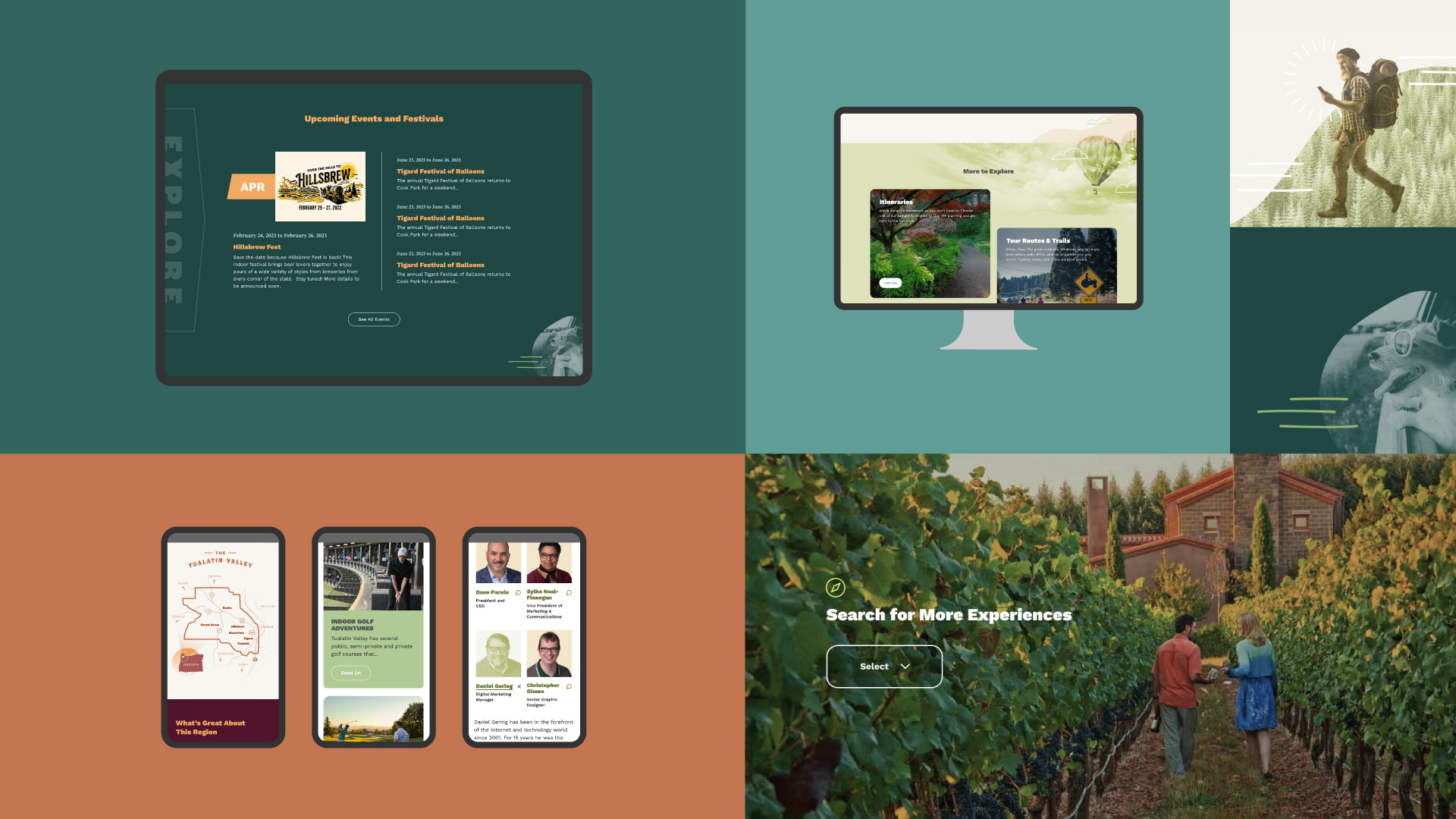
Through it all, we incorporated the eclectic design scheme of the new brand campaign with the restraint and consistency needed to maintain a pleasing online experience.
Getting Organized
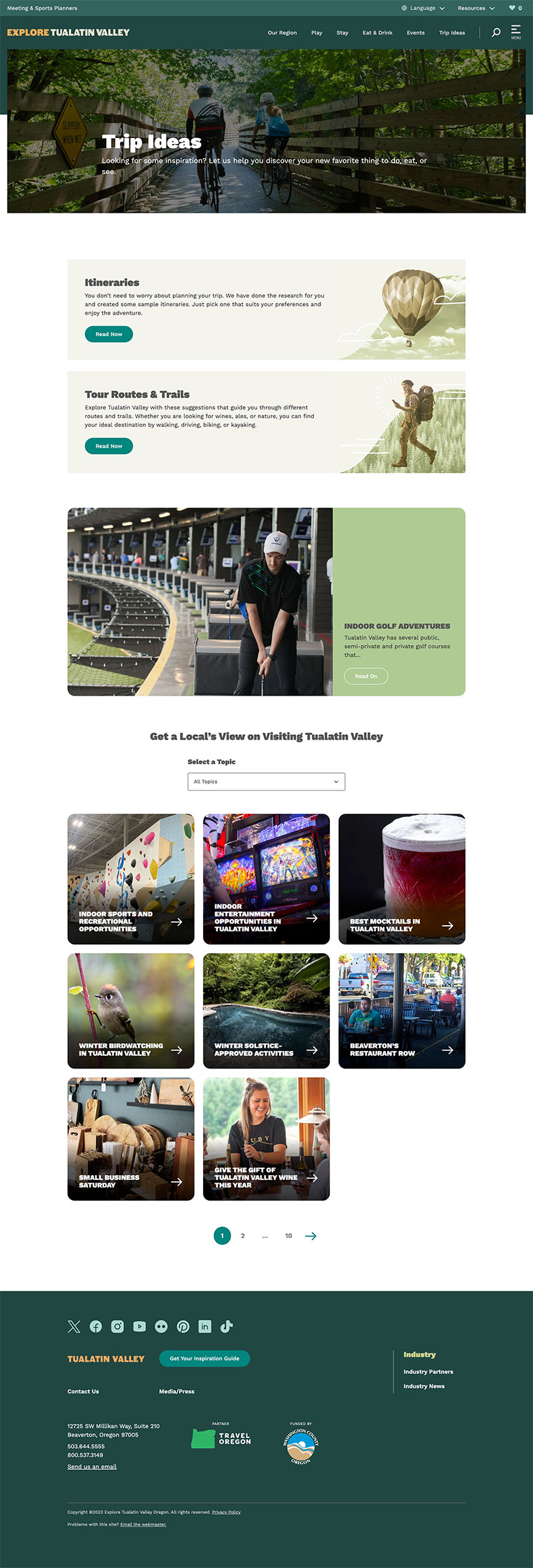
Where the previous content hierarchy was basically flat, we created a system that allows users to browse high-level categories, such as Farm Experiences, then learn more through filtered lists of related POIs (points of interest). This organizational system not only improves browsability and search engine performance, it’s automatically gathered and organized with minimal effort for the client.
Under the Hood
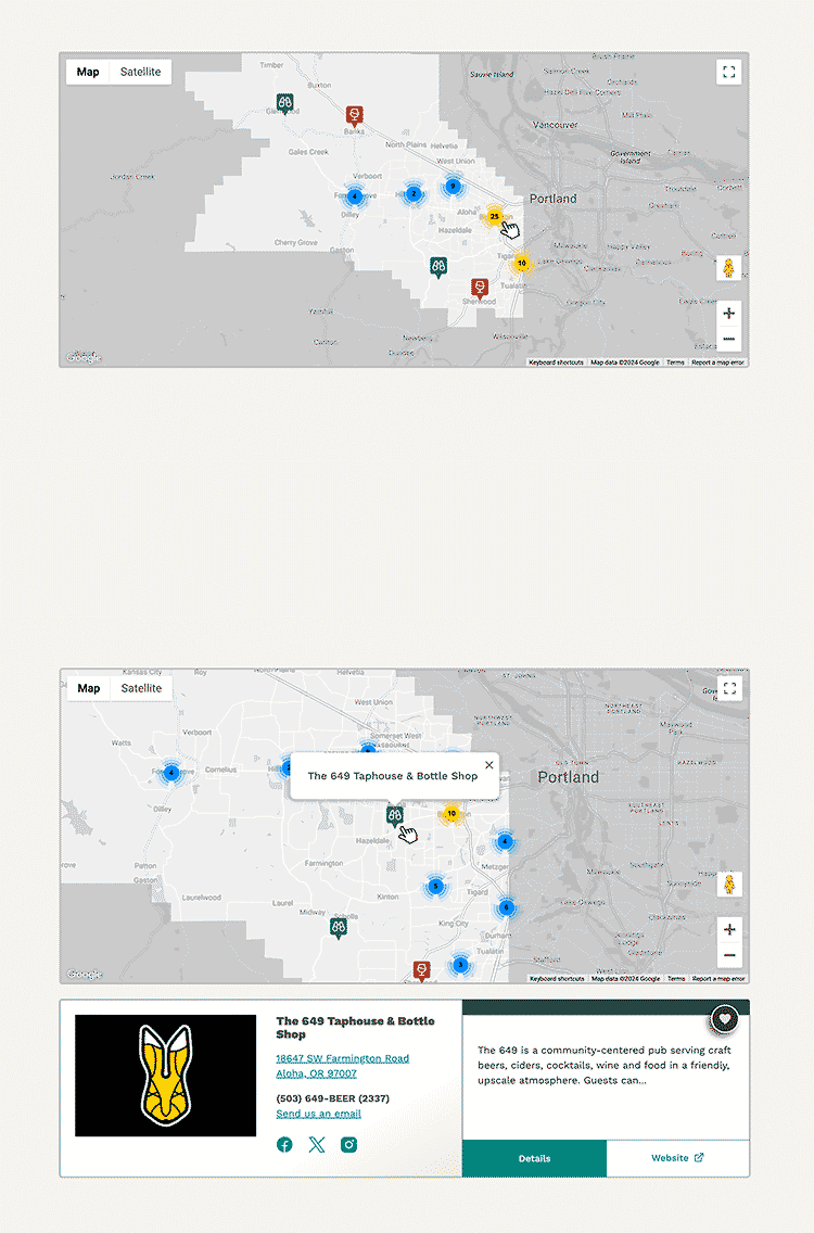
Along with visual design challenges came even bigger technical challenges. In addition to creating a large, custom, client-editable site, we integrated multiple external data streams — POIs from SimpleView, events from Travel Oregon’s OTIS, and email marketing from MailChimp. This required a team effort of creative problem-solving and code solutions to address various significant performance issues.
Creative Options
In most projects, we develop a lot of creative options to extend the client’s visual brand — options which don’t always get used. But that’s okay. Our clients recognize they can rely on us to generate new ideas and offer informed direction as we all pursue the best solutions.
Results
Anecdotal feedback has been overwhelmingly positive, with the client giving us high marks for our commitment to supporting them through testing, training, troubleshooting, and additional requests.
Traffic numbers haven’t been too shabby, either.
733%
Increase in Organic Search Users
(YoY)
250%
Increase in Home Page Traffic
(YoY)
87%
Increase in Visits to Trip Ideas
(YoY)
Let’s talk about your project.
We’ll do a lot of listening, and always look to offer good advice. This could be the start of something great.
Get Started