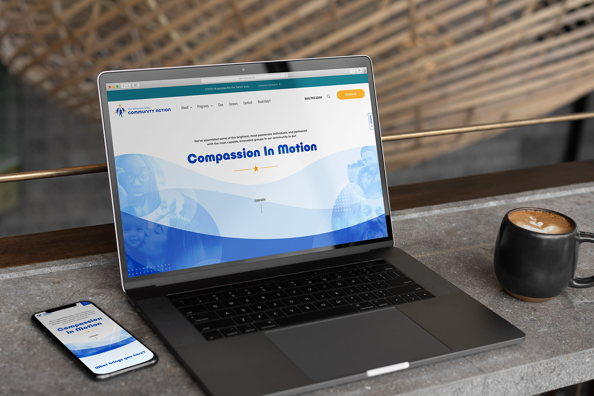
mid willamette valley community action website sample

Case Study

Mid-Willamette Valley Community Action Agency

Brand Refresh, Website Redesign

Mid-Willamette Valley Community Action Agency (MWVCAA) is a regional social services nonprofit aimed at addressing the causes and consequences of poverty. They came to us with a need to evolve their brand into a more accurate representation of the mature and sophisticated organization they had become. Their goal was to increase awareness and funding—and their capacity to meet the needs of the disadvantaged.

mountain

Challenge

MWVCAA’s brand presentation had visual and verbal problems. They struggled to clearly convey their unique positioning, along with their mission, and how their programs work together to support it. They had long been using a poorly executed logo with inconsistent colors and configurations. Component programs each used their own homespun logos, creating the misleading impression that they were independent entities. MWVCAA needed a more cohesive, professional, and inspiring way of representing themselves to a diverse set of audiences, including the general public, policy makers, and others. Moreover, their website was difficult to use for those seeking services.

Our objectives:

  • Create a toolkit of brand assets that reflect a credible, mature, and compassionate organization.
  • Evoke emotion in our audiences, inspiring them to act.
  • Develop a simple and cohesive communication platform that conveys who MWVCAA is, what they do, and why it matters.
  • Create a website that speaks to various audiences, but prioritizes those who are seeking services.
  • Make the website easy to use on a mobile device.

Mid-Willamette Valley Community Action main logo

Mid-Willamette Valley Community Action brand mark reverse

Brand Refresh

For starters, we held a brand discovery workshop with key members of MWVCAA’s leadership. This helped them to distill their positioning and primary messages, while finding inspiring new ways to communicate their mission. Along with designing an updated brand identity system, we developed the tagline “Compassion in Motion”, which simply captures their hallmarks: kindness and action. Then, we documented visual and verbal style guidelines in a brand standards booklet.
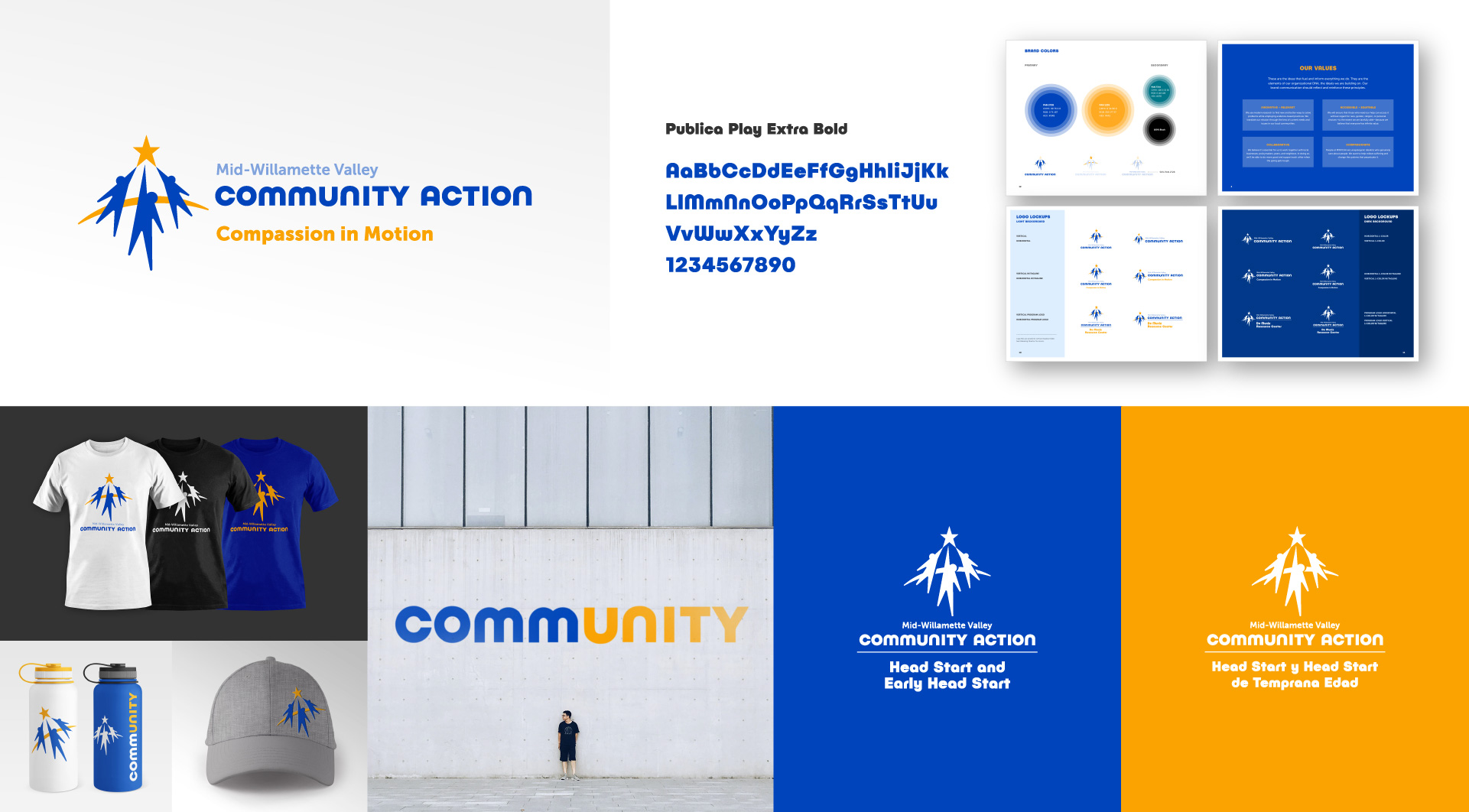
Branding for Community Action by Cardwell Creative montage

programs icon design by cardwell creative for community action

Programs Unified

We designed an infographic to depict the unified relationship between MWVCAA’s programs and the parent agency. A complementary set of logo versions placed the programs in a consistent, logical hierarchy to the main brand.

Website Redesign

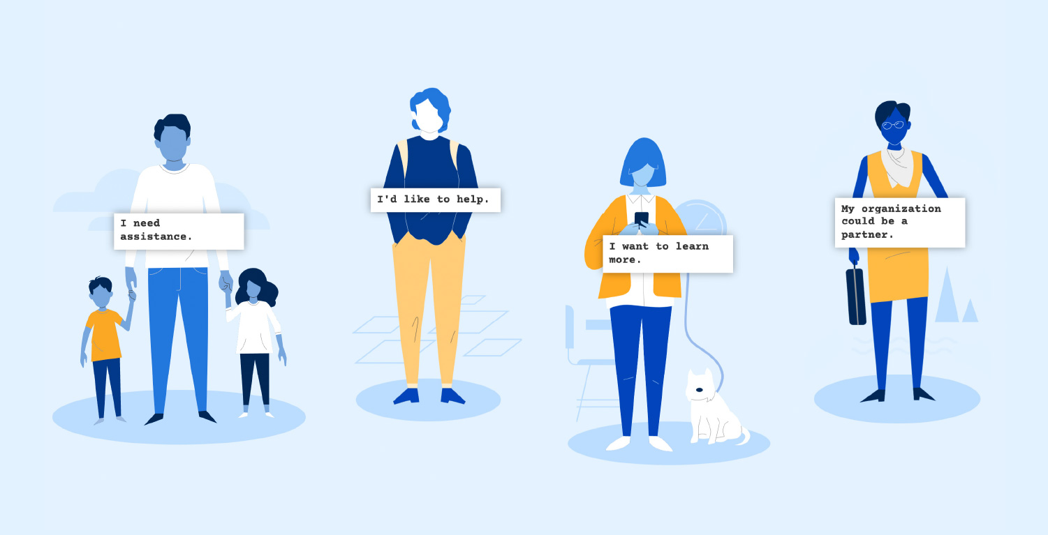
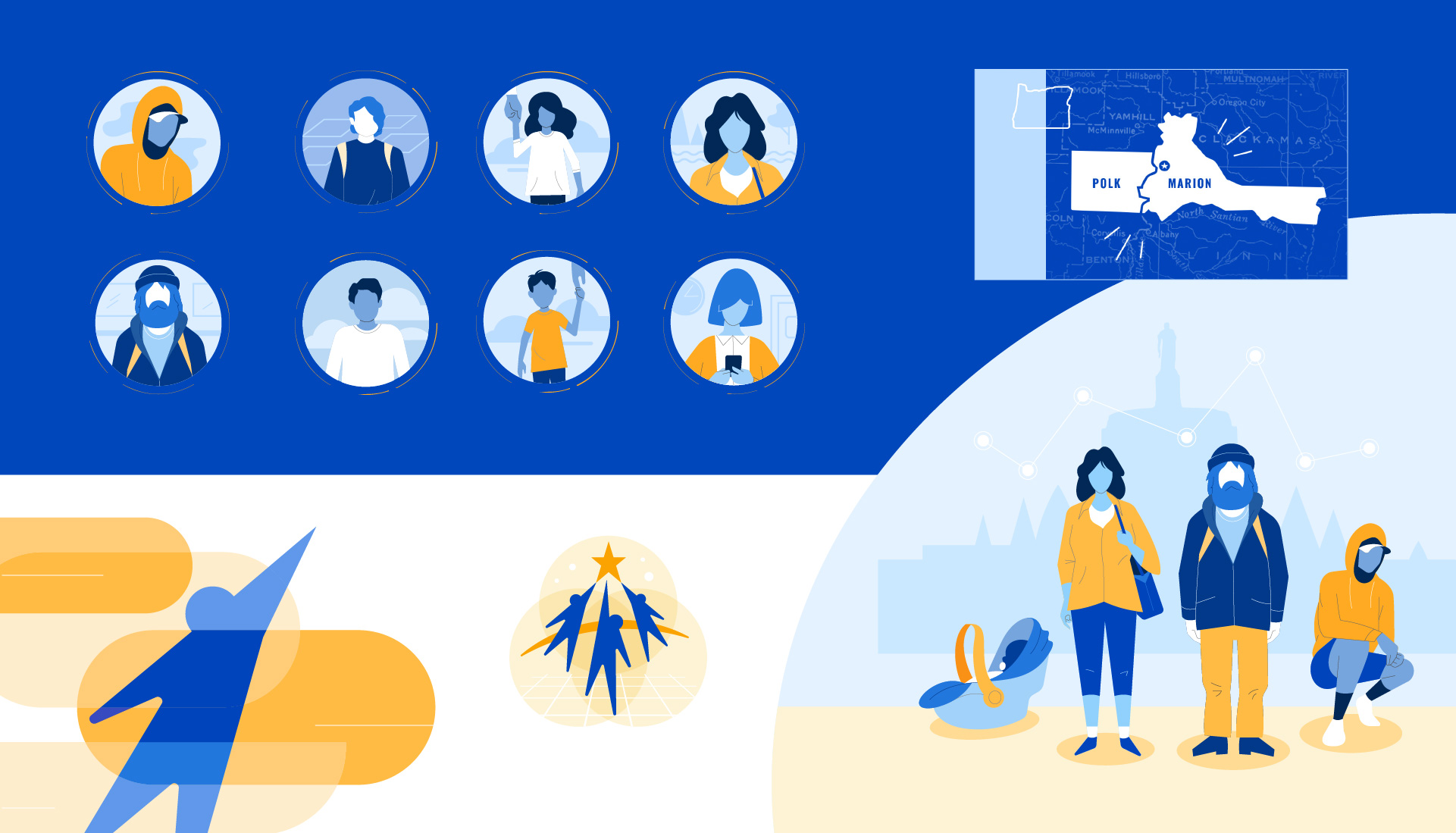
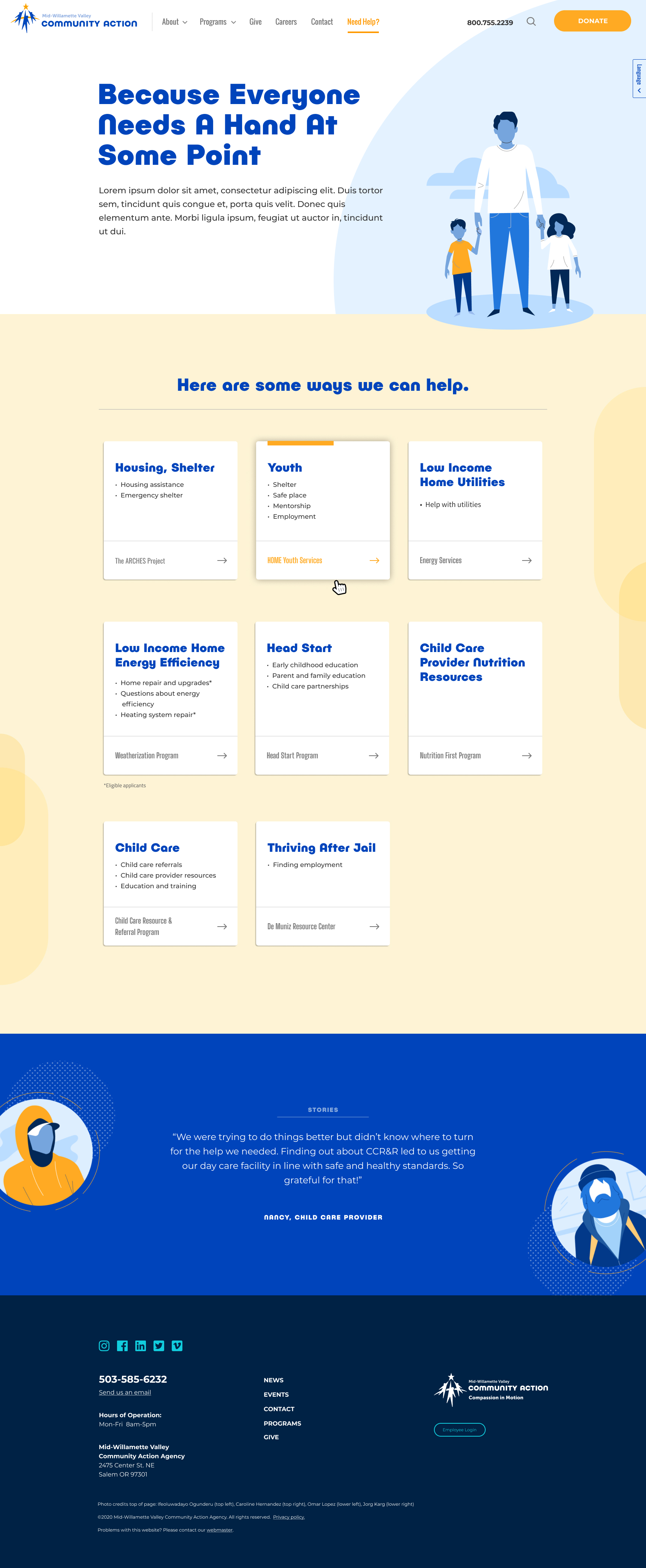
The new MWVCAA website was designed as an extension of their brand, visually and verbally. We created a colorful set of Illustrations to personalize and humanize the experience. A simplified navigation and better content organization made programs easier to find, while giving each of them a consistent format.

As a shift from the previous institutional approach, we helped MWVCAA shape the content from the client’s perspective, focusing on needs and motivations, and avoiding “inside terminology”. The new site offers messages and tools that appeal to the interests of multiple audiences—while prioritizing those needing help. We focused on mobile usability, knowing that most folks seek services with a smartphone as opposed to a laptop or desktop computer.

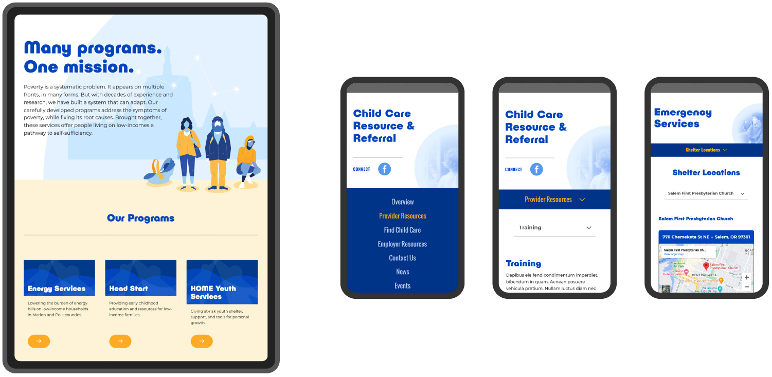
Mid-Willamette Valley Community Action website impacts page
Mid-Willamette Valley Community Action website home page
Mid-Willamette Valley Community Action website need help page

cardwell creative community action program icons

web design mobile views for community action by cardwell creative

vector people illustrations for community action by cardwell creative

community action website illustrations by cardwell creative

infographics for community action website by cardwell creative

Brand in Motion

As a critical asset for fundraising and support-building activities, we produced a brand relaunch video to help MWVCAA explain not just what they do—but also what it means to them, and our community.

flat

Results

Here are some highlights of what we accomplished.

18%

Increase in Sessions

32%

Increase in Mobile Usage

600%

Increase in Search Impressions

Honestly, it's been such an enjoyable experience working with [Cardwell]. We love the website; we love the product. It has been very exciting and I feel very proud to be part of the work they produced.

Mid-Willamette Valley Community Action Agency logo

Dana Schultz Director of Program Development, Mid-Willamette Valley Community Action Agency

Let’s talk about your project.

We’ll do a lot of listening, and always look to offer good advice. This could be the start of something great.

Get Started