Case Study
Oregon Coast Visitors Association
Website Redesign, Campaigns
Challenge
Website Redesign
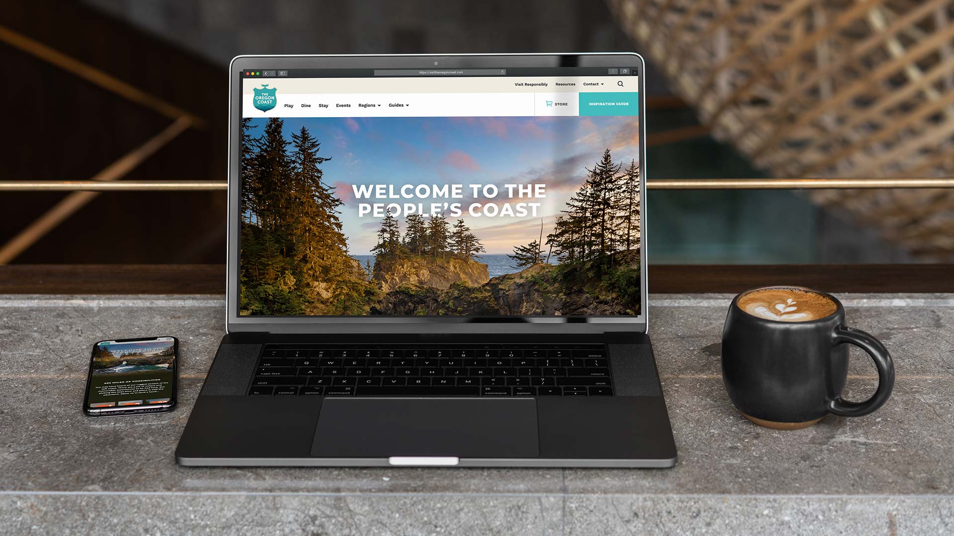
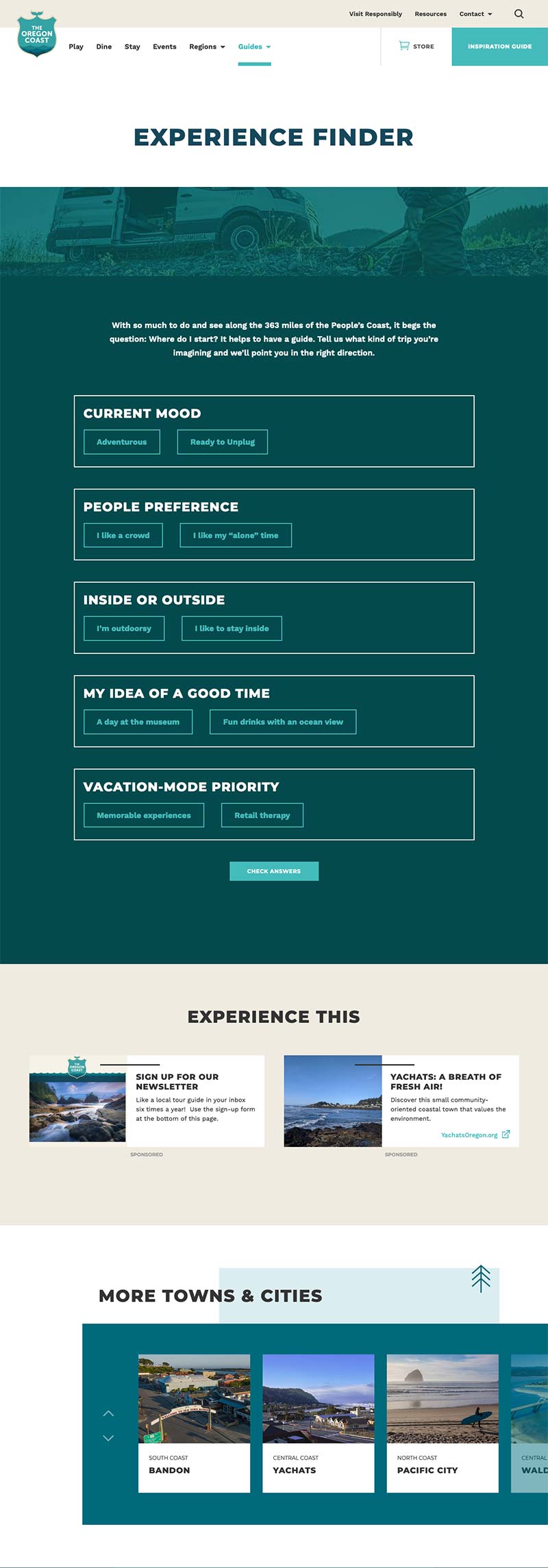
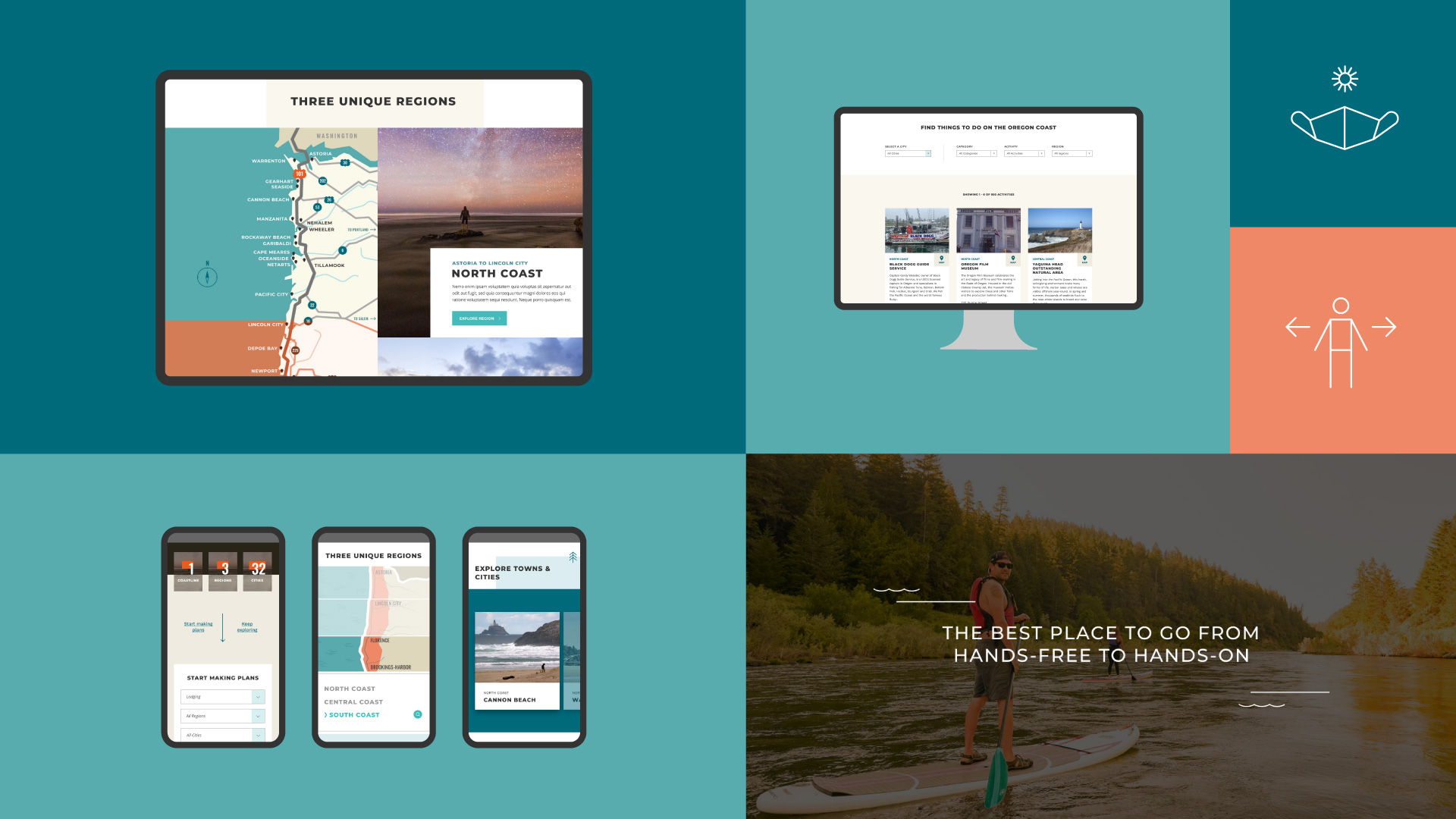
Our incremental process allows us to tackle a complex multi-faceted project in a way that involves the client every step of the way, and prevents important details from being overlooked. On the creative side, we did a lot of listening to understand the client’s vision, then went to work creating a modern outdoorsy look & feel that was immersive and open.
In terms of engineering, we integrated Travel Oregon’s OTIS destination database into the site, providing a consistent source of information to visitors, and additional exposure to local businesses. Beyond creating a library of client-editable templates, we also brought a complex ad system into the framework of the site, then offered training to stakeholders. We applied an immersive parallax effect on the Home page’s hero photo, which is rotated seasonally. Overall, the site illustrates the headline, “363 Miles of Possibilities”.
View the site at visittheoregoncoast.com
Creative Solutions
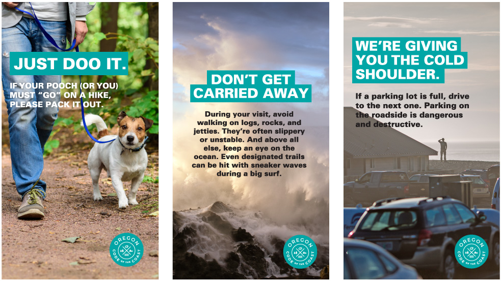
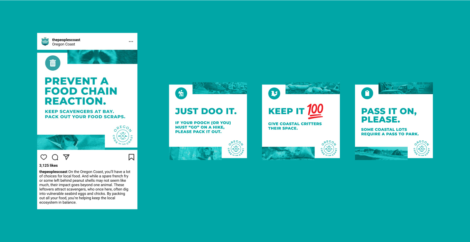
Good marketers have to respond to the times. Heading into the COVID pandemic, the challenge for tourism had shifted from too few, to too many, visitors on the coast. So, we developed a campaign aimed at raising awareness of good trail etiquette. We created the Code of the Coast concept to represent a list of do’s and don’ts, while subtly reinforcing the idea that it’s cool to follow local ethics.
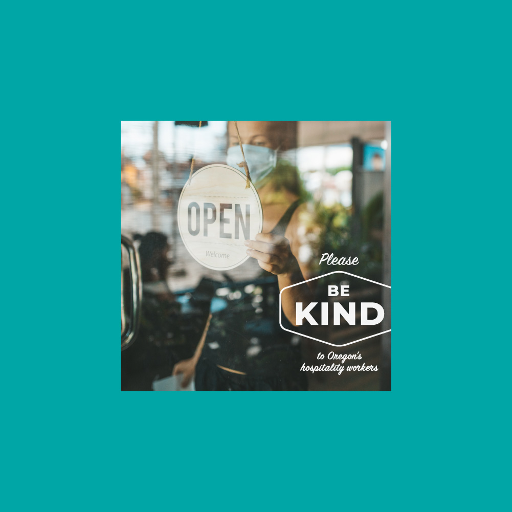
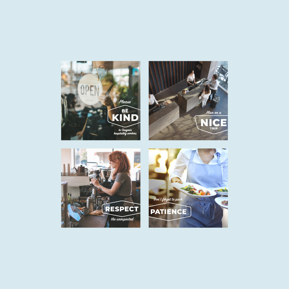
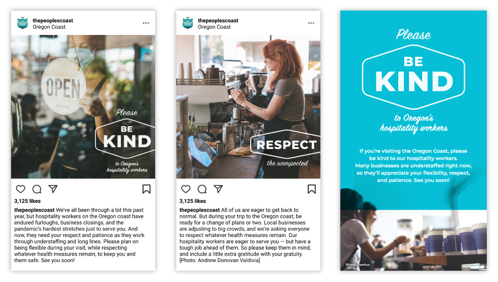
Then, coming out of COVID, we sought to address another new phenomenon: consumers being abusive to local employees. In line with the overall brand personality, and using a voice that encourages visitors to do the right thing without lecturing, we developed the Be Kind campaign, highlighting scenarios that were testing everyone’s patience.
Digital Campaigns
We deployed and managed digital media for both campaigns, including social, search, and online display. This included an ingenious geo-targeting effort that delivered messages to visitors when they arrived at 10 specific high-traffic spots along the coast. Our management of budget, along with ongoing reporting and optimization, allowed the client to ensure good results to their partners while staying focused on other priorities.
Results
Anecdotal feedback on the website redesign has been positive both in and outside of the local tourism industry. OCVA has been able to use the site as a platform for expanding their marketing partnerships, and to gain exposure for important new initiatives. Here are some highlights of what we accomplished.
- Brought the design and creative into alignment with their new brand in a way that elevated it while illustrating new possibilities
- Organized voluminous content, using an improved navigation to make it more accessible to users
- Increased Sessions 19% in the midst of the COVID pandemic (YoY)
- Saw 33% increase in mobile users (YoY)
- Decreased Bounce Rate by 20% (YoY)
- Consistently produced double-digit CTR and sub-$1.00 CPCs for Google Adwords ads
“The final deliverable from Cardwell Creative wowed key stakeholders. The educational, appealing site met all expectations. The streamlined approach to project management made for a smooth collaboration full of flexibility, communication, and creativity. ”
Let’s talk about your project.
We’ll do a lot of listening, and always look to offer good advice. This could be the start of something great.
Get Started