Case Study
Salem Gastro
Brand Identity Design, Full-Service Marketing Support
Challenge
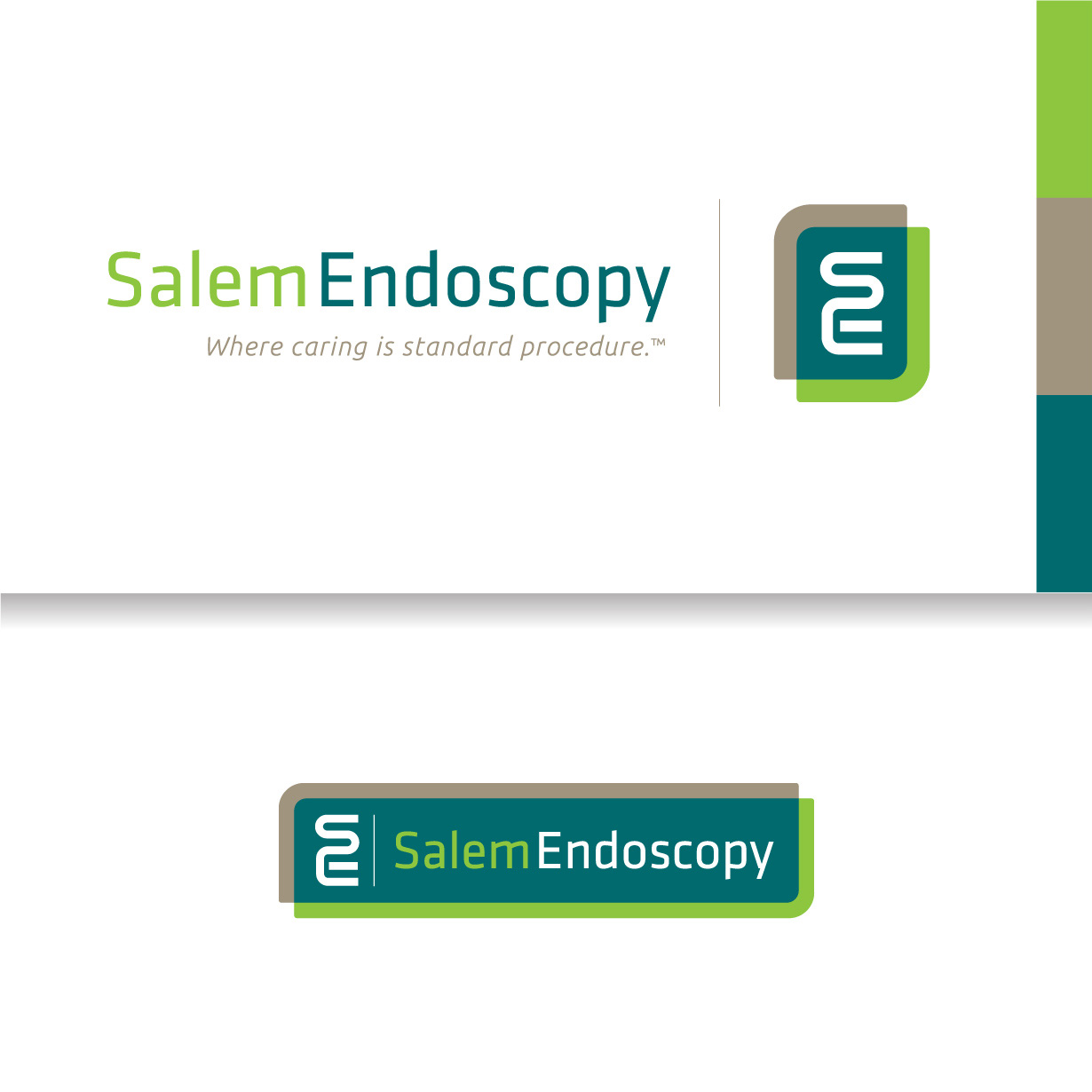
The Visual Brand
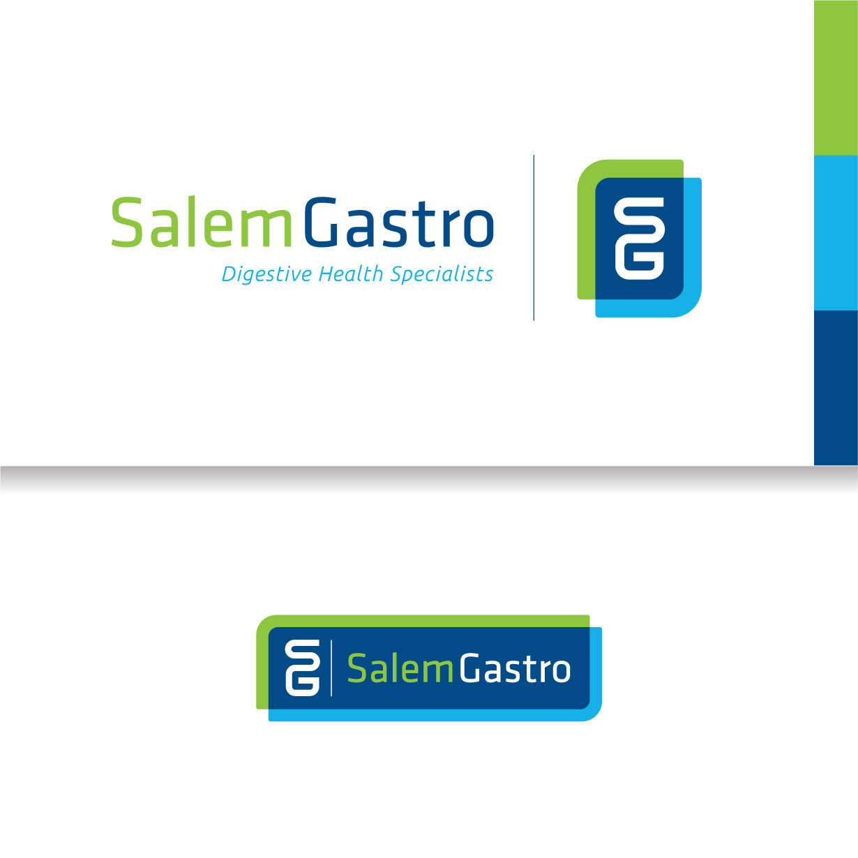
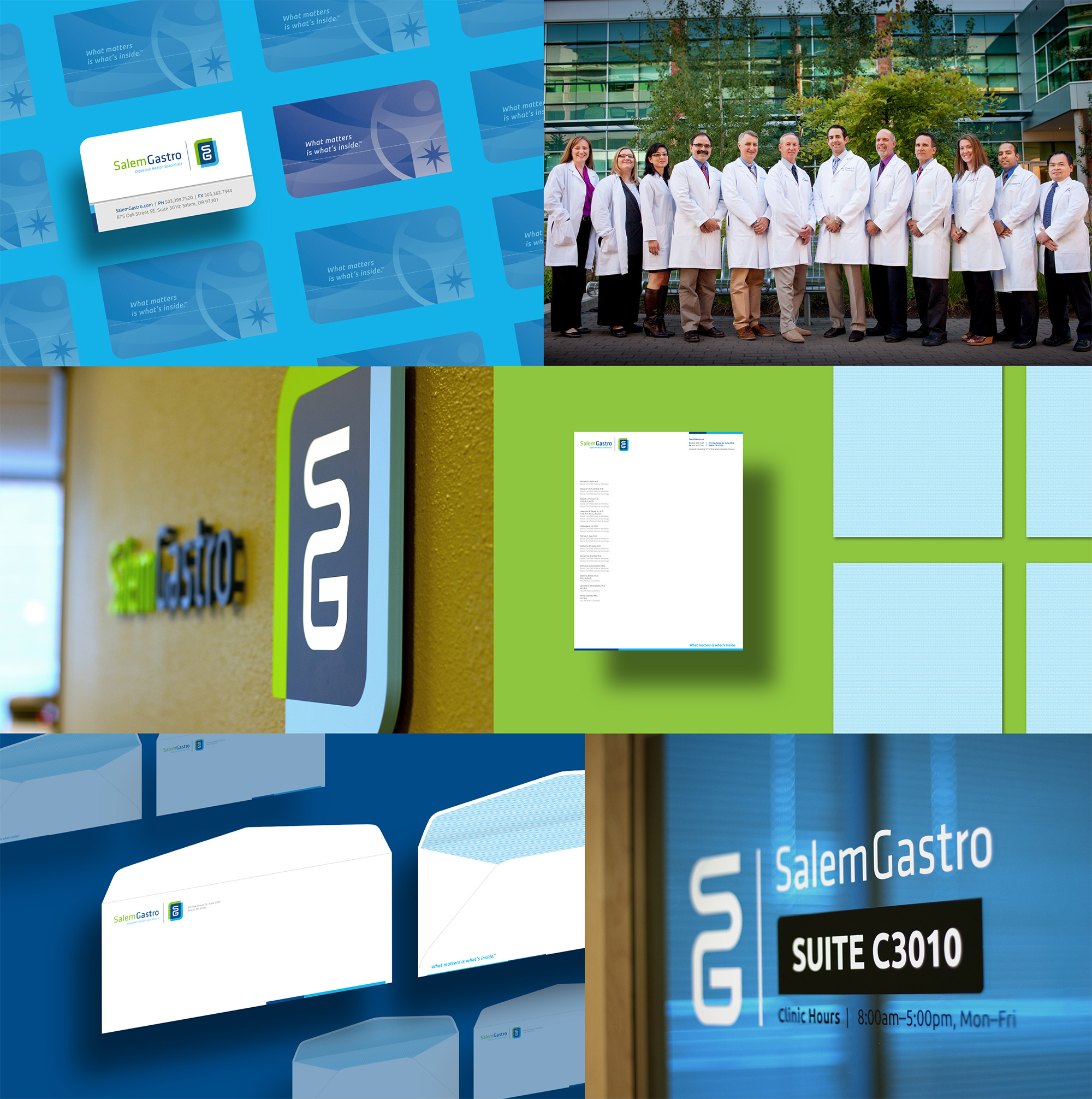
Our first goal was to create a visual identity that blended modern and approachable attributes through the use of bright, clean colors, and simple organic lines. Tubular forms in the monogram subtly allude to the clinic’s specialty and cast the image of internal organs in a more playful light. SG needed a secondary logo for a partner business entity that was clearly independent, but felt well coordinated. We also recommended an ancillary mark and tagline—partly as a way to build consensus among stakeholders—and helped them establish an effective visual hierarchy. We supported the brand roll-out, which included a revamped website, signage, photography, print collateral, and ads.
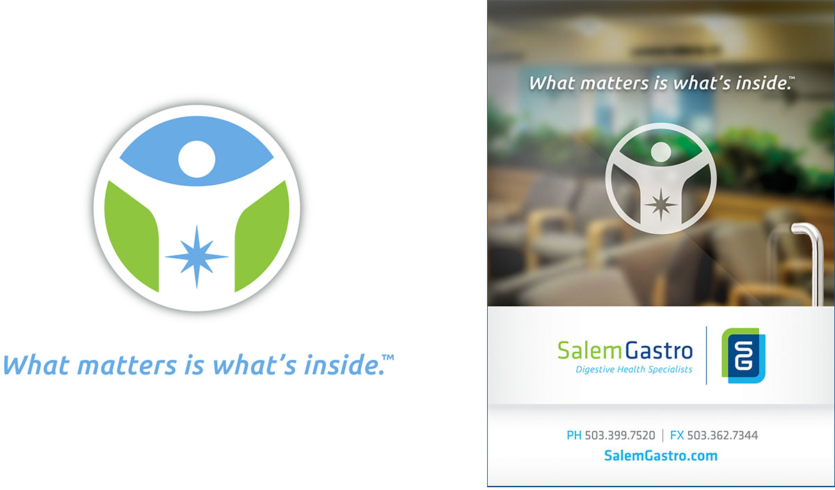
Messaging
After agreeing to ratify the shorter “Salem Gastro” name (which patients had long-since adopted organically), we composed a hierarchy of taglines, led by the most practical: Digestive Health Specialists. The alternate line, What Matters is What’s Inside, alludes to the dual meaning of the importance of patients’ internal health, and the experience they should expect inside the clinic. We also created a tagline for Salem Endoscopy, Where caring is standard procedure—singularly focused on countering the anxiety around exams.
For raising awareness of colon cancer screenings, we developed a campaign theme under the headline Go with someone who knows the territory. This was supported by a whimsical illustration depicting doctors on scaffolding, addressing the human digestive system amidst a wilderness scene. The implication is that SG docs are uniquely knowledgeable about digestive issues and proud of their Pacific Northwest roots.

Tactics
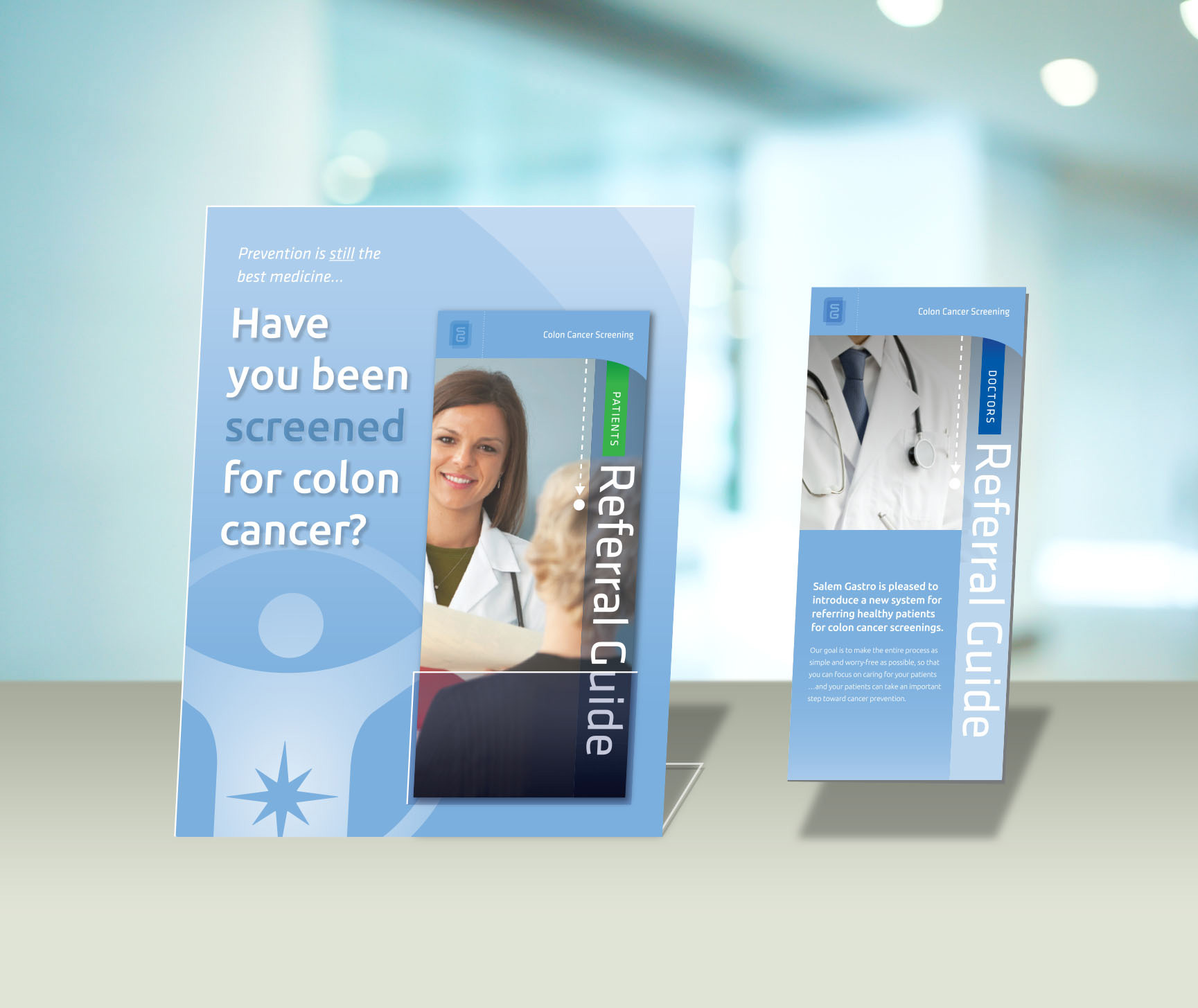
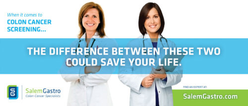
After redesigning all in-office collateral, we created a referral kit for general practice doctors, making it easy for them to refer, and for waiting patients to learn about colon cancer screening. With advertising, we explored new ways to emphasize the importance of seeing a specialist and disarm the stress-laden topic with levity and wit. In one concept, we ask viewers to find a tiny dot among thousands in maniacal bus graphics: symbolizing the difficulty of detecting cancer cells and how crucial it is to seek the help of an expert.


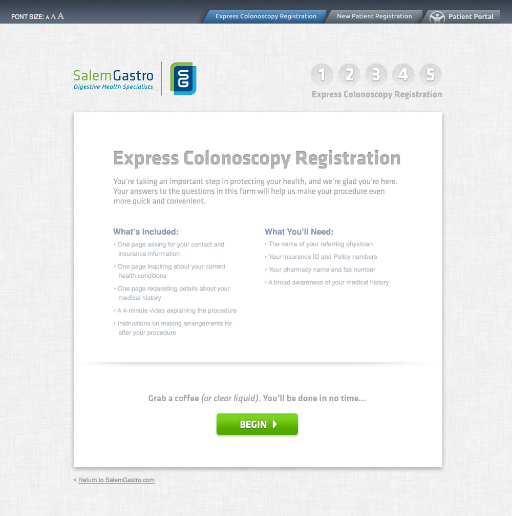
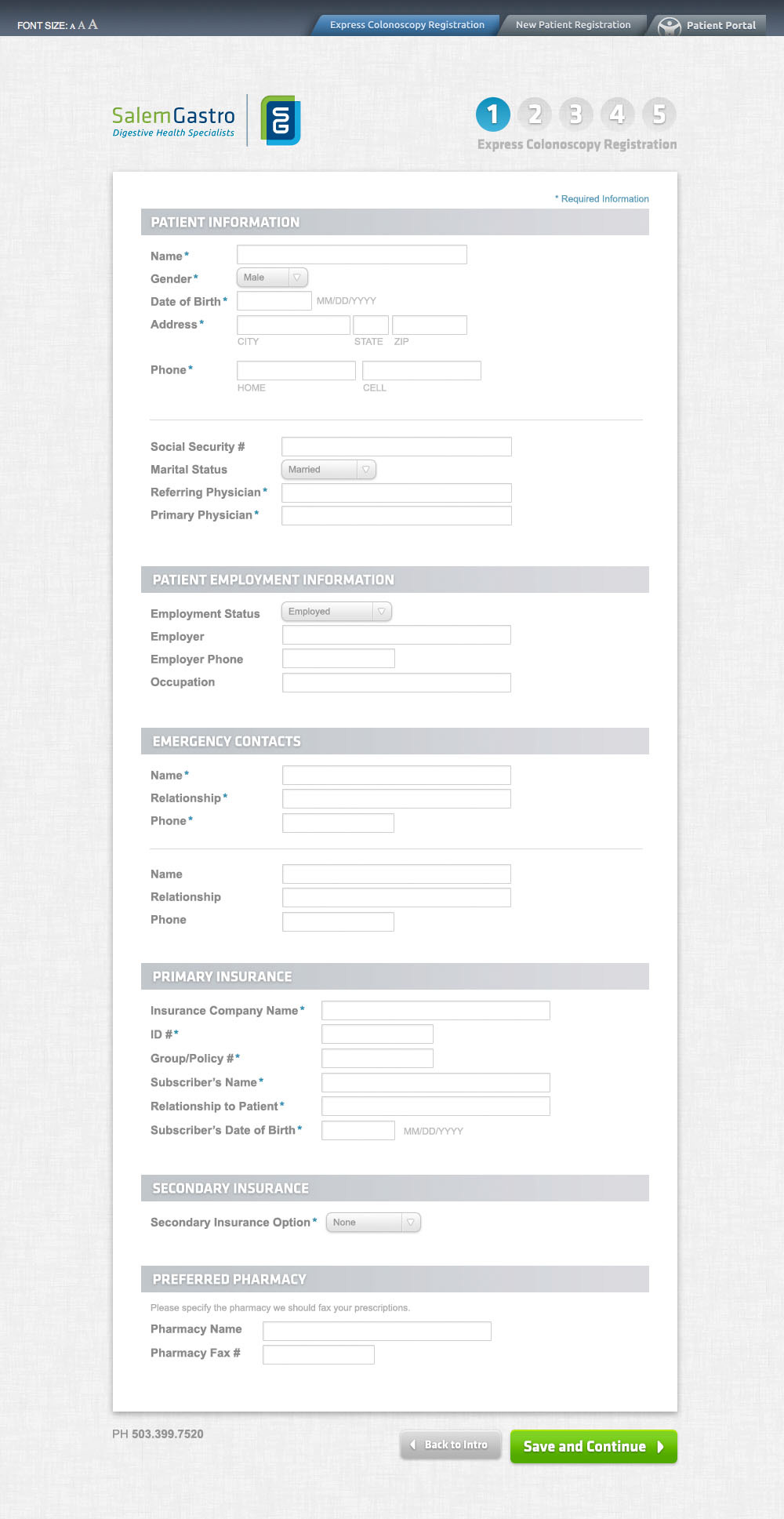
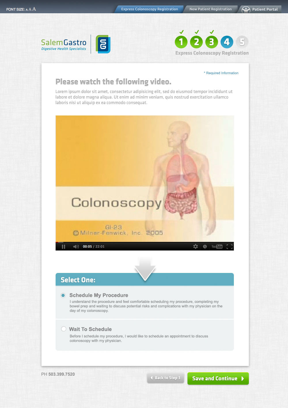
Web analytics showed that a large number of users were dropping out of the online screening registration process. Starting with some in-person user testing, we identified key areas that contributed to the attrition. Then we redesigned the user interface to make it simpler, more modern, and as short as possible while updating badly outdated video content.
Results
The work we did for Salem Gastro put them in a much stronger position to affect perceptions and influence patients toward better health. Knowing that colon cancer is one of the most treatable types if detected early made our efforts particularly rewarding. Here are some highlights of what we achieved:
- Created a strong brand identity that embodies Salem Gastro’s values
- Better positioned them as the preferred specialist in the region; no need to travel to neighboring towns for similar care
- Decreased the dropout rate for online screening registrations
- Gave the client a creative and strategic platform for highlighting the importance of having a specialist perform your colon cancer screening
Let’s talk about your project.
We’ll do a lot of listening, and always look to offer good advice. This could be the start of something great.
Get Started
